
Visualize Stock Data with Python
In today's digital world, understanding stock data is super important for anyone interested in investing or trading. Python, a popular programming language, has lots of helpful tools for working with this data.
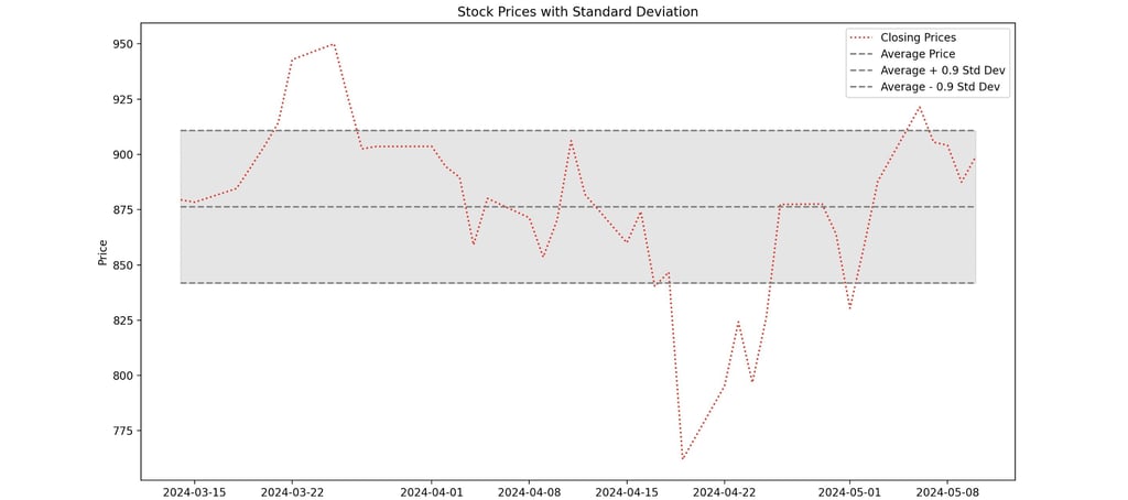
The tool we're talking about today is a great example of this. It takes a stock symbol and shows you a chart. This chart isn't just any chart—it's got the closing prices of the stock over time, plus some other important stuff. One of those things is the average price, which gives you an idea of how the stock is doing overall. But what's really cool is it also shows you a range around that average, based on how much the prices usually vary by using the standard deviation. This helps you see if the stock is behaving normally or if something unusual is happening. Understanding all this makes it easier for people to decide if they want to buy or sell a stock.
Getting Started
To begin our journey, let's first understand the key libraries of the Python script:
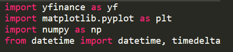
In this code, we start by importing some libraries that we'll need to make everything work smoothly: yfinance, matplotlib, numpy, timedelta, and datetime.
YFinance is a library that's ideal for fetching stock data. It helps us get all the information we need about a particular stock, like its price history and trading volumes.
Numpy is another useful library, especially for working with numbers and doing calculations. In our code, we use it to calculate things like the average price and the standard deviation of the stock prices.
Timedelta is a part of Python's standard library, and it's super helpful for working with dates and times. We use it to figure out the start date that is x number ways from the current or end date.
Datetime is another part of Python's standard library, and it's essential for handling dates and times in our code. We use it to get today's date and then calculate the start date by subtracting a certain number of days from it. This helps us specify the time frame for the stock data we're interested in.
Fetching Stock Data with YFinance
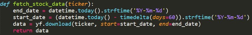
In this step, the collection of data will be performed on a specific stock ticker symbol.
First, you need to decide which stock you want to analyze. This code allows for any stock ticker symbol to be inputted into the program, making it flexible and versatile. Implementing this is straightforward: you simply prompt the user for input and pass that collected input into the "fetch_stock_data()" function.
Next, you'll need to determine the start and end dates for the historical data you want to collect. In this example, we aim to gather data for the past 30 days. This means our end date will be today, and the start date will be 30 days prior to today.
To find the end date, we use `datetime.today()` to get today's date, and then we convert it into a string representation using `.strftime()`. Optionally, you can format the date string to include only the year, month, and day by using `%Y`, `%m`, and `%d`.
Calculating the start date follows a similar process, but we use the `timedelta` function to subtract a specific number of days—in this case, 30—from today's date.
Finally, we execute the yfinance library, which we imported as `yf`, to download the stock data for the specified ticker symbol and date range. We accomplish this by running the `yf.download()` function with the ticker symbol, start date, and end date as parameters. Once the data is retrieved, it's returned for use in plotting the graph.
Calculations with NumPy
Implementation of NumPy to do calculations:
This straightforward section of the code serves as the initial step toward plotting the graph, although it could also function as a separate standalone function. Here, we pass the data obtained from YFinance, referred to as stock_data, into the function.
From this dataset, we extract only the closing prices by referencing the "Close" column using brackets notation.
With the closing prices over the specified timeframe in hand, we proceed to calculate the standard deviation. Leveraging NumPy, which we imported as np, simplifies this task. Instead of creating a custom function, we utilize NumPy's built-in standard deviation function. Additionally, to exercise prudence in defining the range to be plotted, a percentage of the standard deviation can be employed. In this instance, I've opted for 90 percent of the standard deviation, reflecting a more conservative approach.
Subsequently, we calculate the mean by employing NumPy's mean function, which efficiently computes the average of the closing prices.
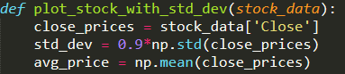
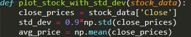
Chart Visualization with MatPlotLib
Making graphical images of the collected data:
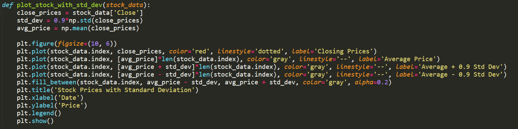
To begin visualizing the stock data, we set up the plot area with a specified size ensuring clarity and readability. This step lays the foundation for our graphical representation, facilitating a comprehensive analysis of the stock's performance over time.
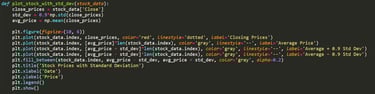
The first line we plot showcases the closing prices of the stock across the selected time period. By employing 'plt.plot(stock_data.index, close_prices, color='red', linestyle='dotted', label='Closing Prices') ', we create a visual narrative of the stock's price fluctuations. Here, the x-axis represents dates, derived from the stock data's index, while the y-axis portrays the corresponding closing prices. Using a dotted red line enhances visibility and distinguishes this crucial data series.
Continuing with our visualization, we introduce a horizontal line representing the average price of the stock. Utilizing 'plt.plot(stock_data.index, [avg_price]*len(stock_data.index), color='gray', linestyle='--', label='Average Price')', we highlight the mean value amidst the price variations. The gray color and dashed linestyle lend prominence to this benchmark, aiding viewers in understanding the stock's overall price trend.
Our analysis extends further as we delineate the upper and lower bounds of the stock's price range. Employing 'plt.plot()' twice, we craft lines to denote the average price plus and minus 0.9 times the standard deviation. These lines, portrayed with a gray color and dashed linestyle, provide insight into the stock's price volatility, aiding in risk assessment and decision-making.
To visually emphasize the range encapsulated by the upper and lower bounds, we employ 'plt.fill_between()' to shade the area between these lines. This graphical representation enhances comprehension, enabling viewers to discern fluctuations in the stock prices more intuitively.
Adding essential elements to our plot, we incorporate labels for the x-axis and y-axis using 'plt.xlabel('Date')' and 'plt.ylabel('Price')', respectively. Additionally, a title is assigned to the plot with 'plt.title('Stock Prices with Standard Deviation')', offering context and clarity to the visualization.
Concluding our visualization journey, we enhance interpretability by adding a legend using 'plt.legend()'. This succinctly labels each component of the plot, enabling viewers to understand the significance of each line depicted.
Finally, with 'plt.show()', we render the plot, culminating in a comprehensive graphical representation of the stock's performance, supplemented by statistical insights
Conclusion
In conclusion, the Python code presented here exemplifies the power of programming in analyzing and visualizing stock data. By harnessing libraries such as yfinance, matplotlib, and numpy, investors, traders, and financial analysts gain access to sophisticated tools for making informed decisions in the dynamic world of finance.
Through the step-by-step breakdown of the code, we've demonstrated how to fetch historical stock data, calculate key statistical measures such as average price and standard deviation, and create insightful visualizations that offer valuable insights into a stock's performance.
By plotting the closing prices alongside the average price and standard deviation bounds, we provide a nuanced understanding of a stock's price movements, aiding in risk assessment and decision-making. The use of descriptive labels, clear titles, and visual cues enhances the interpretability of the plot, empowering users to extract actionable insights with ease.
Ultimately, this project serves as a primer for leveraging Python's capabilities in financial analysis, offering a foundation upon which users can build their understanding and proficiency in exploring stock data. With the right tools and techniques at their disposal, individuals can navigate the complexities of the stock market with confidence and precision, poised to capitalize on opportunities and mitigate risks effectively.